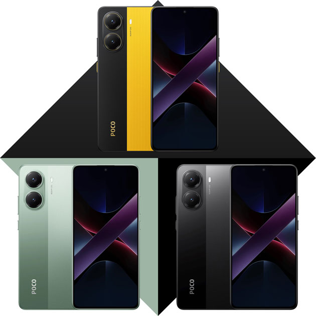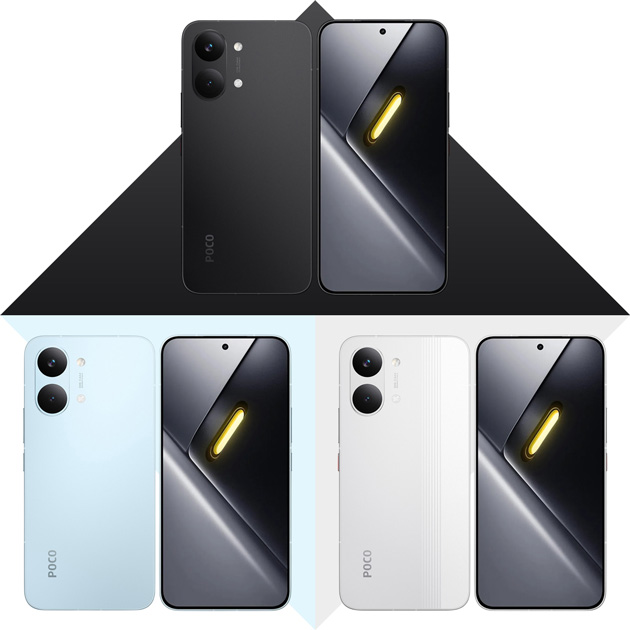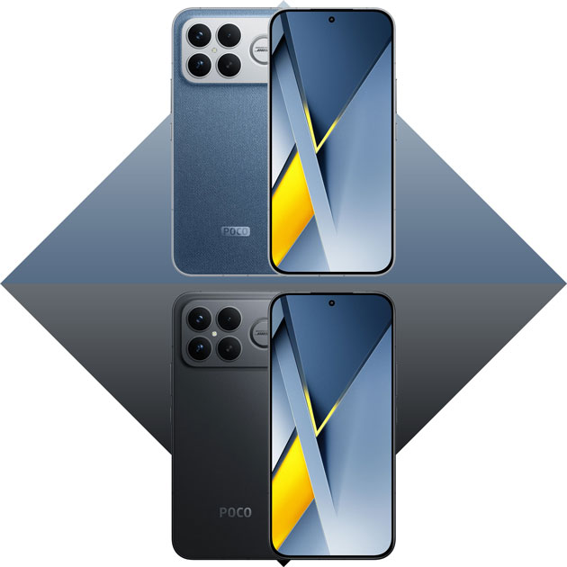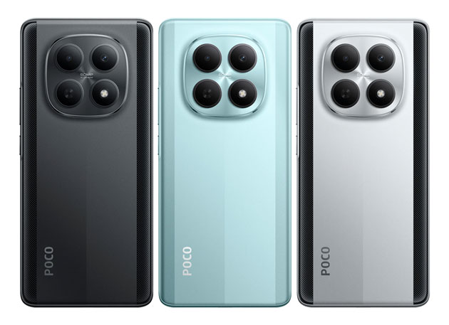
If you’re going to hold the Poco M8 every single day, which of the three colors green, silver, or black is the best choice? I checked out the design and vibe of each color to make the choice easier for you.
Green

When I first held this Poco M8 Green, it honestly felt like a cold drink on a hot summer day! The color isn’t loud or flashy at all. It’s a very soft, delicate green with a hint of icy blue. If you’re tired of the usual black and silver, this color can completely change the vibe of your phone.
When you hold the phone and look closely, you’ll notice the back panel isn’t completely solid. There are two wide vertical stripes with a fine striped texture on the sides that play beautifully with the light, keeping it from looking plain and boring. It has a matte finish that feels great in the hand and doesn’t show smudges or fingerprints too much.
As for cases, it’s the same old story. Even if you slap on a clear case to show off that unique color, after three months when the sun and your sweaty hands turn it yellow, the combo of this light green phone and a yellowed case will look like a mashed melon, which really isn’t a pretty sight!
But just look at that camera module. It seriously looks like a four-burner stove! You feel like if the phone overheats, you could just put a pan on it and fry up a couple of eggs for breakfast.
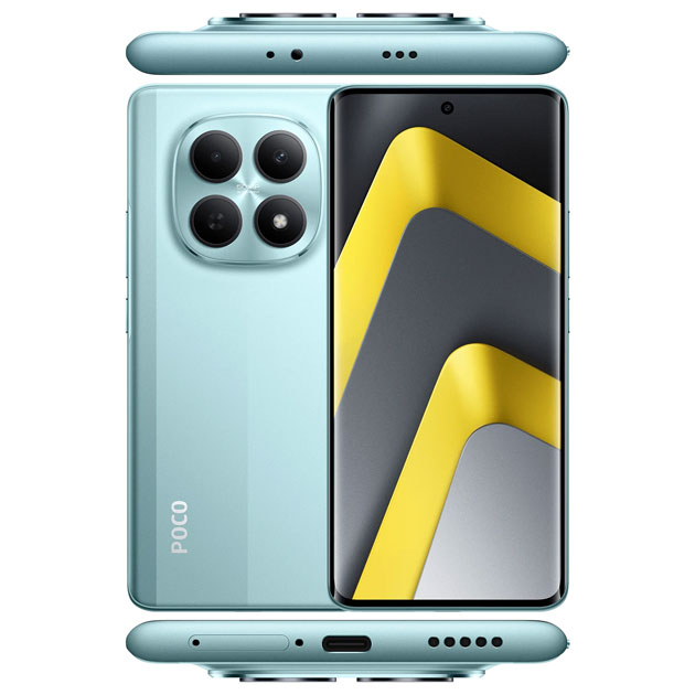
If you like soft pastel colors and want a phone that stands out a bit without being too flashy, this Poco M8 Green is a solid choice. But if you’re a bit more conservative and want your phone to be classic and low-key, you might want to go for Silver or Black, which I’ll talk about next.
Silver

This silver version gives off a totally different vibe from the green one, and I think Poco intentionally went for a racing, cyberpunk feel here. The main body color is a very stylish icy metallic silver that really pops in the middle of the back panel.
The main annoying (or maybe cool, depending on your taste) difference is those two wide black carbon fiber stripes they put on the sides. This design reminds you of tuned sports cars, like you painted racing stripes on a hood. It looks really unique, but maybe a bit too busy and attention-grabbing for someone looking for a simple, quiet phone.
This color is the king of hiding smudges and fingerprints! It’s practically made for picky people who freak out over seeing fingerprint marks on their phones. This light, matte finish is the best option to keep your phone looking clean all the time.
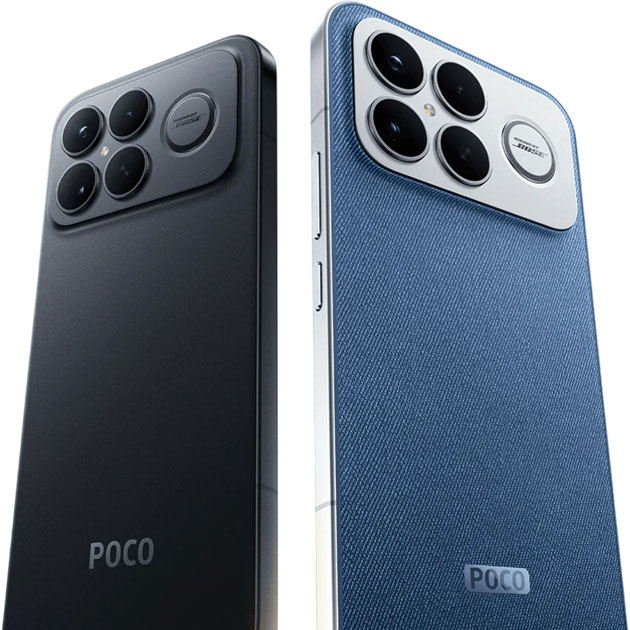
The camera island on this color stands out even more than on the green model because of the light background. It’s a big shiny silver circle with four deep black lenses that create a huge contrast with the body.
Silver and gray, just like black, never get old or go out of style. Even if you hold this phone ten years from now, no one will say the color is outdated.
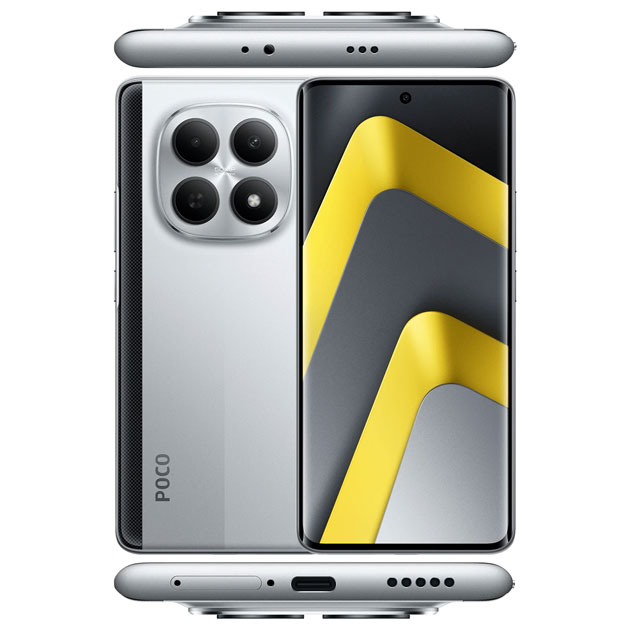
This Silver is one of the most attractive Poco M8 colors and I think it’s a much smarter choice. It’s classy and stylish, plus it’s way less of a hassle to maintain. It gives off a sense of power and tech and easily matches any case. That green color was a bold choice that you might get sick of after six months, but this silver is a color you can use for years without getting bored.
Black
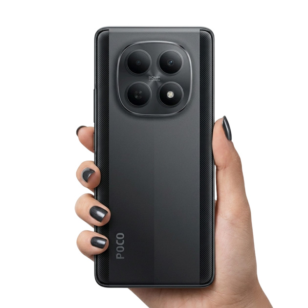
We’ve entered the Batman phase! 🦇 This black color totally gives off the vibe of bulletproof cars or stealthy gadgets. We went from that loud green and industrial silver to the most classic and hassle-free color possible.
This color is actually a charcoal black or a very dark, matte gray. Those two carbon stripes on the sides are here too, but since the background itself is dark, they don’t scream at you and blend beautifully into the body. This means you still get that sporty feel, but without shouting “look what a unique phone I have”. The matte plastic body also helps hide everyday dirt to some extent.
There’s no color contrast here, and everything is drowned in a solid dark theme.
The best thing about this color is that the giant four-burner camera module gets lost in the black back panel! It doesn’t pop out like it does on the silver color and looks much more seamless and stylish. Only the white LED flash creates a little bit of contrast, but I think this small contrast brings the camera module to life a bit so it isn’t totally boring.
The POCO logo written at the bottom is also very subtle and muted. It isn’t like some brands that print their logo in shiny gold for everyone to see! 😄 It’s very minimal and stylish here.
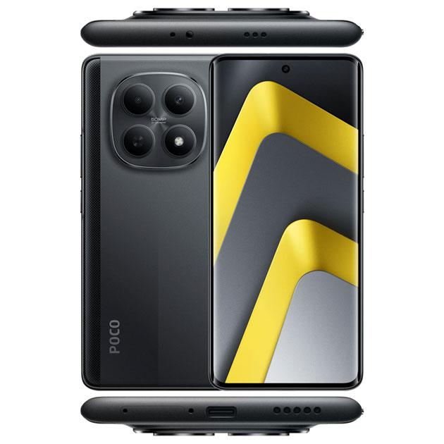
Black is a color that matches any case, works in any situation whether formal or sporty, and is way easier to sell later than fancy colors. Of course, it’s a bit boring and repetitive! Nearly 90% of people on the street have black phones, so there’s no real excitement or uniqueness to it.
But the Poco M8 Black isn’t boring! The two-tone design with the carbon fiber gives it personality, the matte finish makes fingerprints less visible, and overall it has a premium, professional feel.