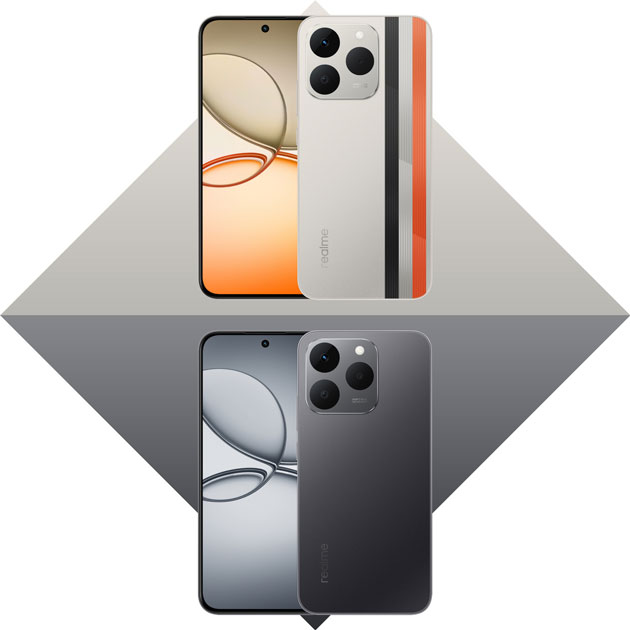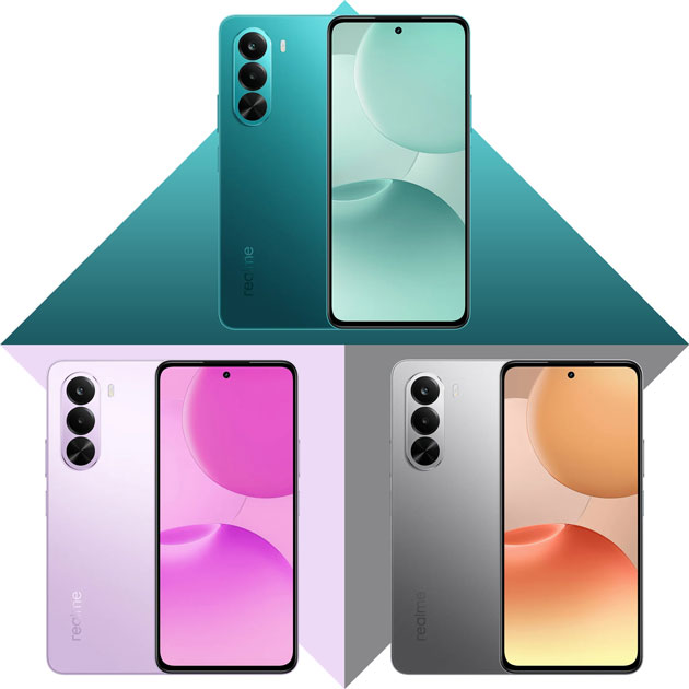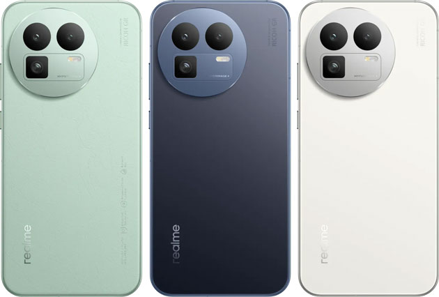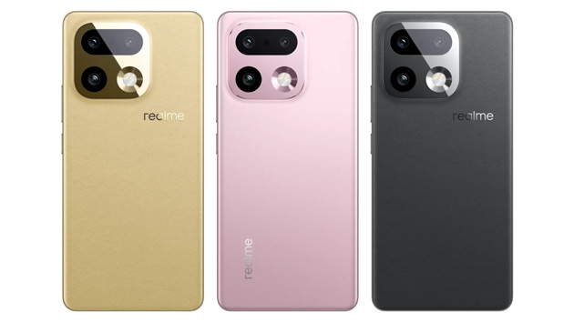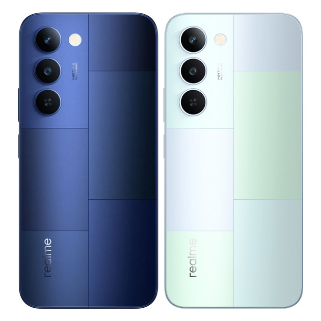
It’s true the Realme P4 Lite only comes in Mosaic Green and Mosaic Blue, but they’re both so gorgeous that choosing just one can be pretty tough. As always, I’m here to dive into the design details of each one and help you pick the perfect color for yourself.
Mosaic Green
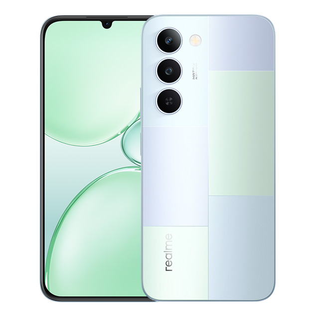
When I first saw the Realme P4 Lite Mosaic Green, the first thing that struck me was that it’s definitely not just pure green. It’s a mix of a soft pastel green with a really light blue and even a bit of silver. It feels like Realme wanted to create a calm, cool color that’s easy on the eyes.
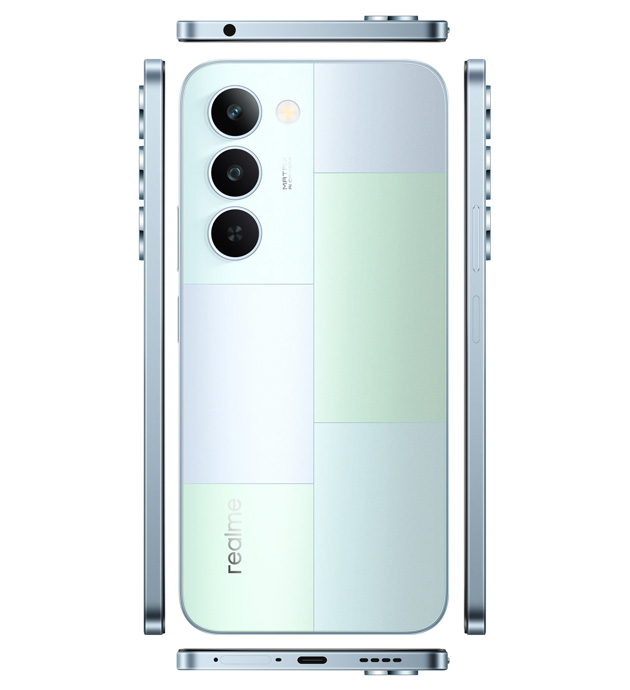
The mosaic design, which gives the phone its name, really has a modern and minimal vibe. They’ve divided the back of the phone into a few rectangular sections, and each one has a different shade of those pastel colors. One part leans more towards green, another is bluer, and another is almost a silvery white. Honestly, up close, this design looks pretty unique, but it might seem a bit busy to some people. Basically, you’re either going to really love it, or you’d prefer a simpler back.
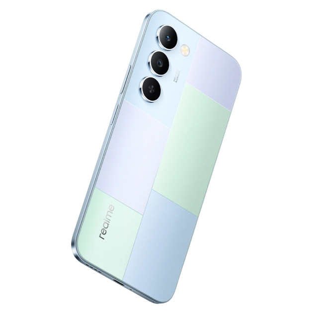
The camera module isn’t anything crazy, just three circular lenses arranged vertically. At least Realme didn’t go for an over-the-top design there, which keeps the back looking neat. Another thing is that this Mosaic Green color is super neutral. It’s not specifically masculine or feminine, so it works perfectly for anyone. You just have to be okay with that mosaic pattern, because a huge part of the P4 Lite’s visual personality comes right from it.
Mosaic Blue
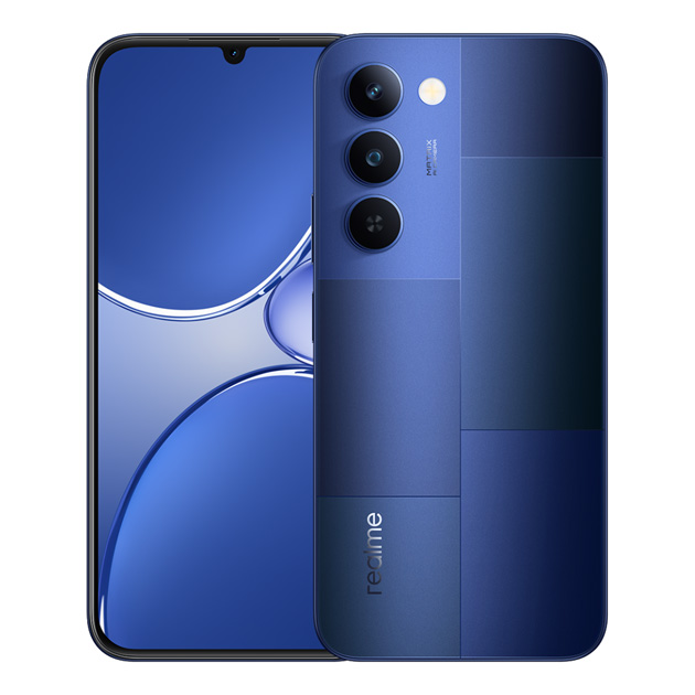
The first vibe you get from the Realme P4 Lite Mosaic Blue is that it’s way more serious and elegant than the green one. It has a deep, dark blue that shifts between navy and indigo in different lighting. This one definitely has a lot more personality.
We still have that same mosaic design, but the difference here is that the various shades of blue really pop. One part is a lighter blue, another part is darker and closer to navy, and this contrast between light and dark gives it a really cool depth.
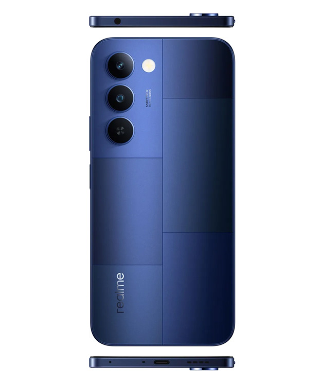
Honestly, this color is a better choice for people who want their phone to look a bit classier and more formal. It has a much more mature and professional feel compared to that pastel green.
I’m telling you this as a friend, dark backs, especially if they aren’t completely matte, absolutely love finger oils. I mean, the second you hold it without a case, your fingerprints will stick to it, and that sleek look turns into a smudgy mess.
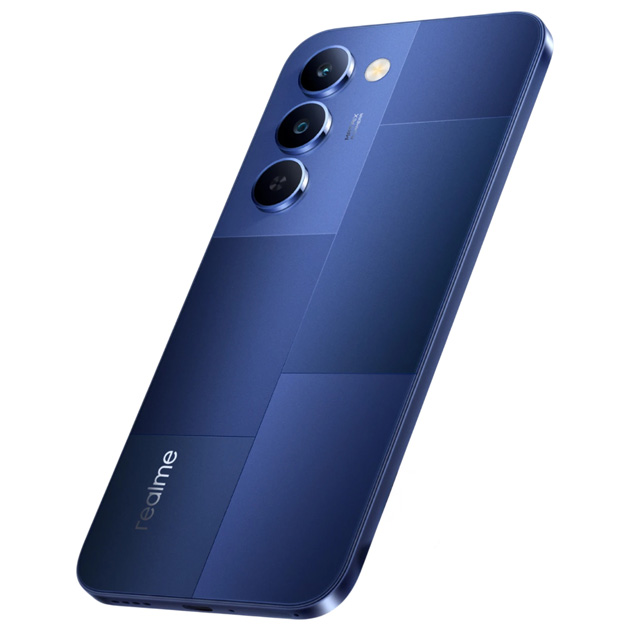
One thing that might be an issue for some is that this color is a bit serious and heavy. If you’re looking for something fun and light, it might feel too formal. But if you’re a conservative or professional person who wants your phone to look good in business meetings too, this one is perfect.
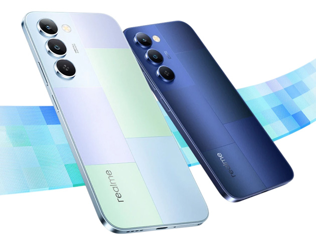
If I had to compare, the Mosaic Green is for soft and calm people, while the Mosaic Blue is for those who want something with more character and a bit more formality. They’re both beautiful, but they give off completely different vibes.