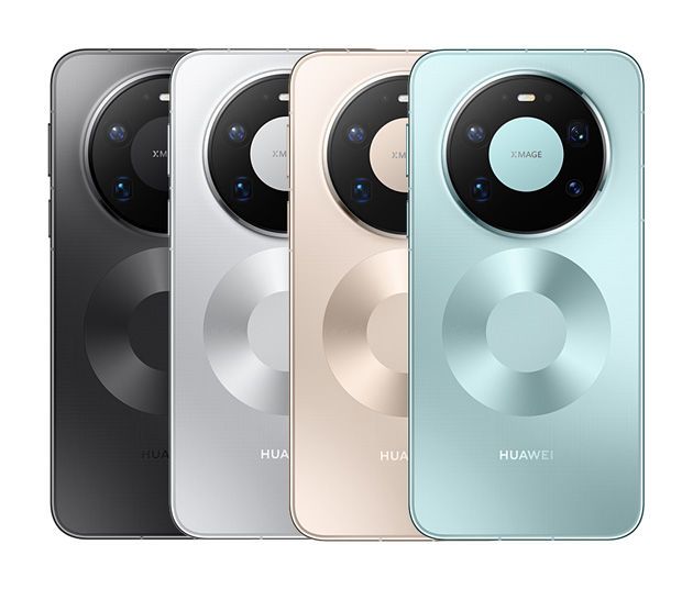
Every color of the Huawei Mate 80 Pro Max has its own vibe and personality, and picking one is basically like picking a lifestyle. I’m here to walk you through all of them so you can find the one that actually fits your style.
Gold
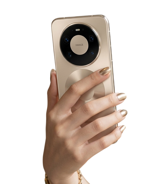
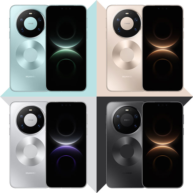
Thank goodness this isn’t one of those loud, shiny golds that looks like a pirate’s tooth! The gold Huawei went with here is actually really subtle and classy, with a nice matte finish that keeps things elegant.
One big win with this lighter matte surface is that fingerprints don’t show up nearly as much as they would on a glossy gold. You won’t be wiping it down with your shirt every five minutes.
But what really grabs your attention is that massive camera module. A big black circle sitting right in the middle of that gold body creates a serious contrast, and it’s got a metallic ring around it that gives off luxury watch or high-end industrial gadget energy. Honestly though, the first time you see it you might think “Okay Huawei, did it really need to be that big?” But it grows on you.
Below the camera there’s a large glossy circle that mirrors the module’s shape. It’s more of a design element than anything functional, and it keeps the back from looking too bare. It feels like the designers wanted the back to have a visual signature.
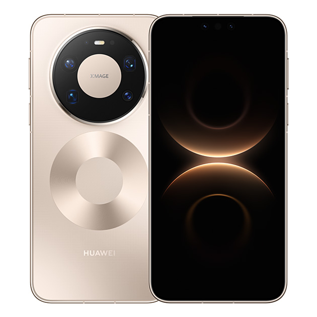
Now, the case situation is real here too. Clear cases turn yellow over time, and on this gold? You’re getting a pretty gross combo. Throw on a colored case and you’re basically hiding the whole design (and the money you paid for it) under a piece of rubber.
If I’m being straight with you, the Mate 80 Pro Max Gold is for someone who wants a luxury phone but doesn’t want it screaming “look at me” from across the room. It’s classy, it’s distinctive, and it’s got a little boldness to it. Just know that if you’re a case person, half the appeal walks out the door on day one.
Blue
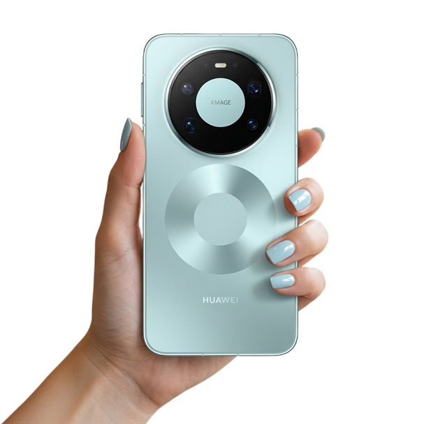
Now this one is the kind of color you either instantly connect with or just don’t get at all. (I’m personally a fan.)
It’s not a dark, formal blue. It’s a bit more unique than that, like someone mixed icy blue with just a hint of turquoise. It’s cool and fresh, reminds me of summer, though honestly they could’ve called it “Arctic Breeze” or something and it would’ve suited it way better than just Blue.
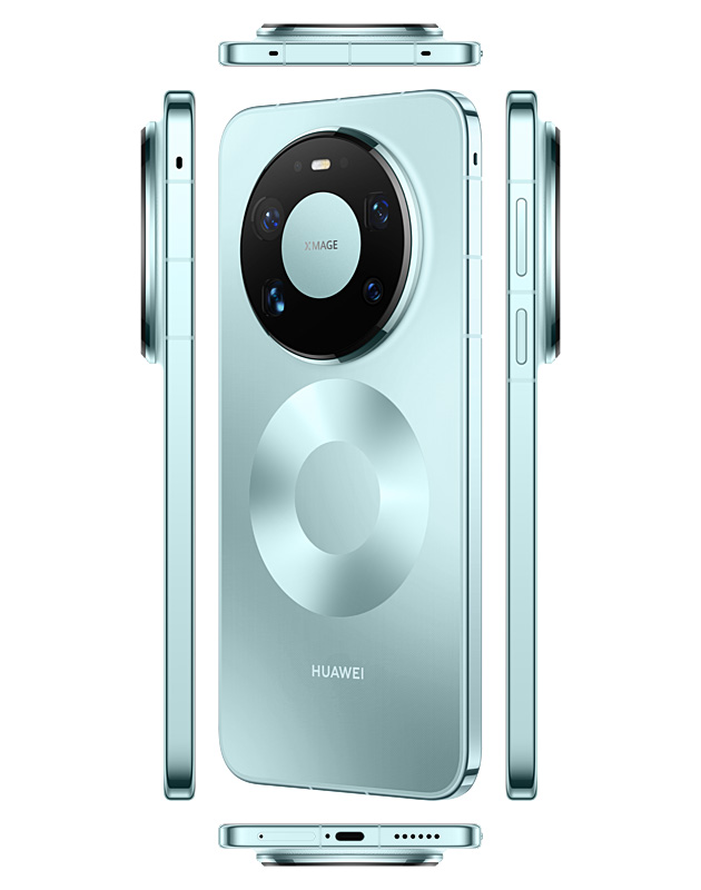
Under light it has this really subtle, cold shimmer that makes me think of polar ice. The glossy frame adds to that premium feel. That signature circle on the back with its unique texture looks great in this color too, and when light hits it, it creates this interesting little light show. The HUAWEI logo sits quietly at the bottom. If you want a phone that stands out and catches light in your hand, this color delivers.
The back surface is matte just like the gold version, so light spreads softly across it without that harsh glare some phones have. Fingerprints don’t really announce themselves either, which is genuinely great for anyone who doesn’t want to be constantly cleaning their phone.
The big camera module is the same story as always, a large black circle sitting on that blue body. Honestly though, I feel like it draws less attention on the blue than it does on the gold. At first you might feel like half the back is just camera, but that contrast between the black module and the blue body actually makes the whole design feel a bit bolder.
That glossy circle at the bottom shows up more clearly here since it stands out against the blue background. Some people might say it’s too decorative, but if you’re into designs that do something different, you’ll probably make peace with it. At least it keeps the back from looking like every other phone out there.
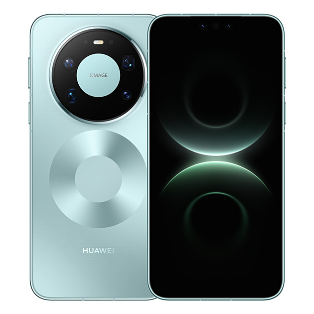
The biggest issue is what happens with clear cases. Here’s the simple math: clear case plus time equals yellow. Yellow plus this icy blue equals green. Not a nice green either, more like a sad, wilted lettuce kind of green. So yeah, skip the cheap clear case with this one.
It’s a fresh, youthful color. If you’re tired of dark and boring and you don’t want to look too formal or too flashy, the Mate 80 Pro Max Blue is a solid pick. It hits a nice balance between looking sharp and looking different.
Silver
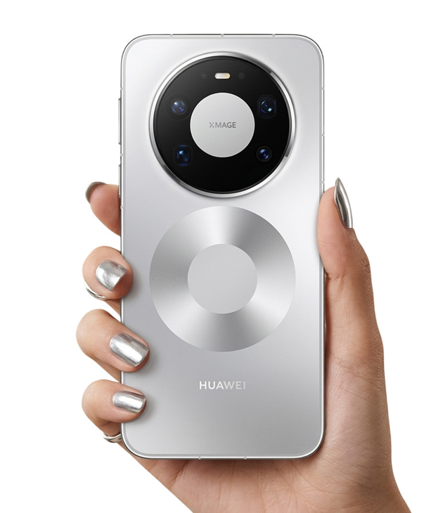
This one went full Terminator mode. The metallic feel of the silver takes the Mate 80 Pro Max completely out of “normal phone” territory and makes it look more like a spare part from a robot cop or a piece of a space shuttle.
The contrast between that black camera module on top and the silver body is intense. It genuinely looks like a cyborg scanning you with its big dark eye, and you half expect a red laser to shoot out of it at any moment.
The back still has that matte finish, which means fingerprints don’t ruin the experience, and for a phone this size that’s actually a blessing. If it were glossy, you’d basically need to carry a microfiber cloth everywhere.
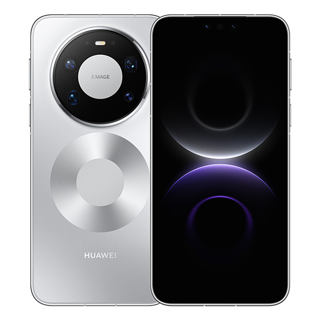
One thing worth mentioning is that silver is a cold color by nature. If you want a phone that feels warm and inviting, this one might start feeling like a cold piece of metal after a while. But if you love tech with a raw, industrial look and you want your phone to feel like something out of an Iron Man movie, silver is absolutely your pick.
Black
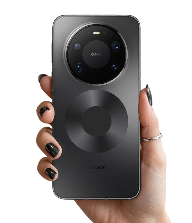
And this is where the puzzle completes itself. In black, that camera module finally blends into the background. It’s not jumping out at you like it does on the lighter colors. The whole back becomes one dark, unified piece.
But that bottom circle… in black it looks exactly like a gramophone record! It’s like Huawei made a deal with DJs everywhere and said “we’ll put a little DJ deck on the back so you can scratch and remix tracks on the bus.”
The matte finish on the back was honestly a great call for black specifically. If it were glossy, five minutes in and it’d be covered in fingerprints, looking more like a crime scene than a phone. Here though, fingerprints stay pretty invisible and the phone keeps its clean look.
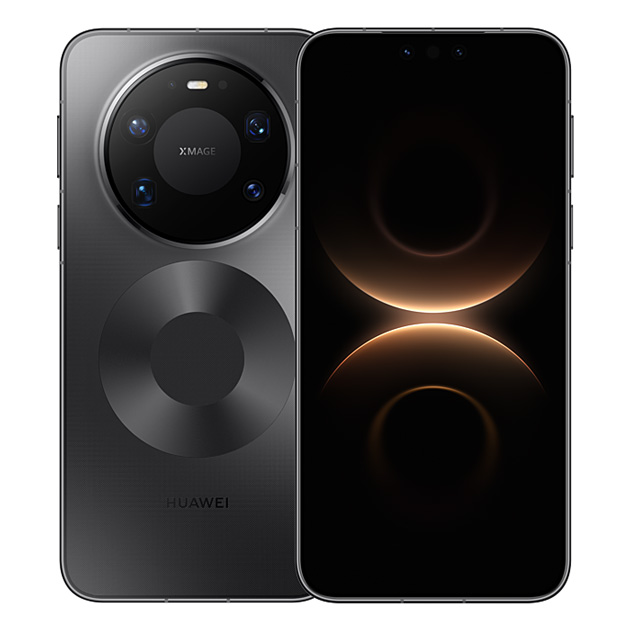
Unlike the gold, blue, and silver, if you throw on a clear case and it yellows after a few months, it’s not a disaster on black. You’re not getting that swampy green situation. At worst the phone just looks a little duller.
It might not be as distinctive as the blue or give off that luxury feel like the gold, but it’s got one solid advantage: you’ll basically never get tired of looking at it. That said, I’m still personally rooting for the blue.