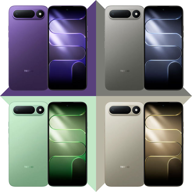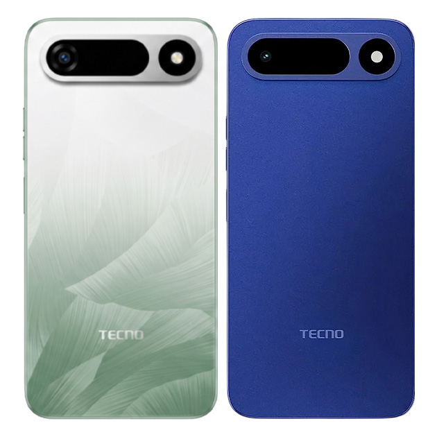
Stuck between Ripple Green and Midnight Blue for the Tecno Pop X? Let’s dive into the design details of both colors to see which one is best for you.
Ripple Green
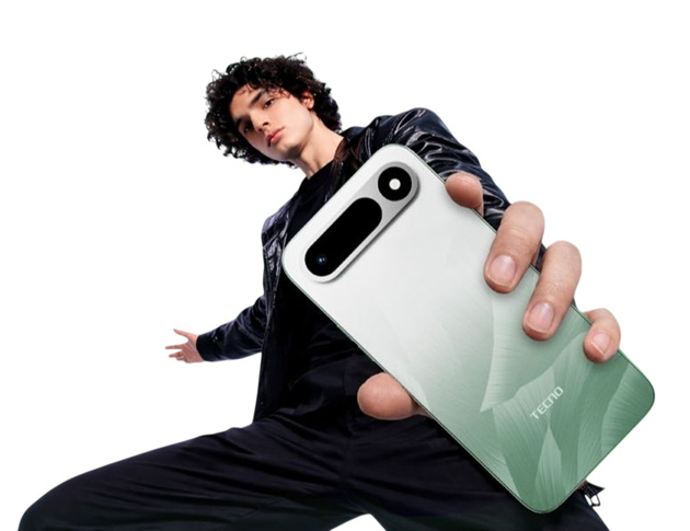
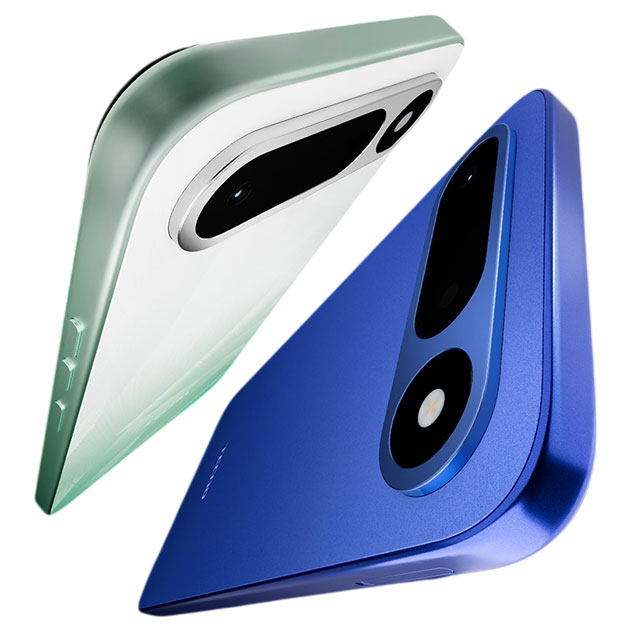
Let’s talk about Ripple Green first. Look, this is a very soft and lovely color. It’s a very pale pastel green that starts white at the top and gradually gets greener as it goes down. It has a smooth gradient that is actually done really well; you don’t see any harsh lines, and the color doesn’t change suddenly. It’s calm and gradual. It has a wavy pattern on it, like someone shook a piece of silk cloth and took a picture of it. It’s very soothing and eye catching.
The back design also has a very soft brushed look that makes the phone seem a bit more premium. It’s not like you’ll say wow, what a masterpiece, but it’s different enough that when people see it, they’ll be like, whoa, what a cool color! what brand is that?
If you put a case on it, you lose 80% of this charm. This color is mostly for people who use a clear case or no case at all. It’s the perfect middle ground for someone who wants a special touch without being overly flashy.
Midnight Blue
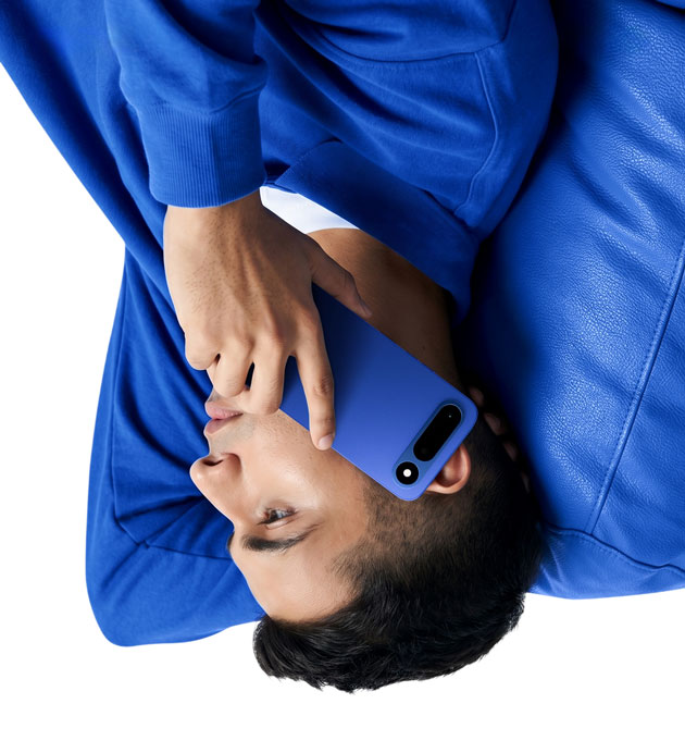
First of all, the name is a bit of an exaggeration for this color. It’s more like an early evening blue or a regular matte navy blue than a deep, dark midnight! It’s like Tecno’s marketing team wanted to put a really cool name on a completely standard color.
The design is simple, but this very simplicity somehow makes it look quite classic. It’s a solid color without any pattern or gradient. Unlike Ripple Green which had that wavy design, here we just have a clean, simple surface. The TECNO logo sits at the bottom center in a light blue that looks really good on this dark blue and creates a nice contrast.
The back cover is matte plastic. The good thing is that it’s not a mirror like glossy phones where you have to clean it with the corner of your shirt every five minutes. It’s a much safer choice for formal environments or people who don’t want to attract attention.
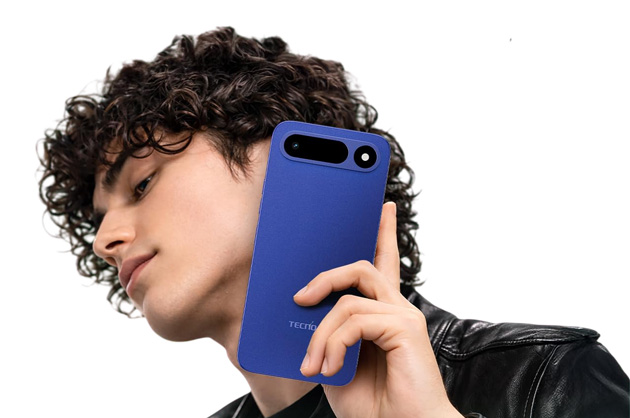
The Tecno Pop X Midnight Blue is very neutral and universally appealing. It’s not too feminine and not too masculine. It’s perfect for anyone who likes having a conservative yet stylish phone. You can take it anywhere like work, college, or parties, and it won’t look out of place. Let me add that this color pairs really well with colorful cases! That means if you ever get bored of this plain blue, you can slap on a yellow, red, or green case and completely change its look. That’s one of the perks of neutral colors like dark blue or black, they match with everything.
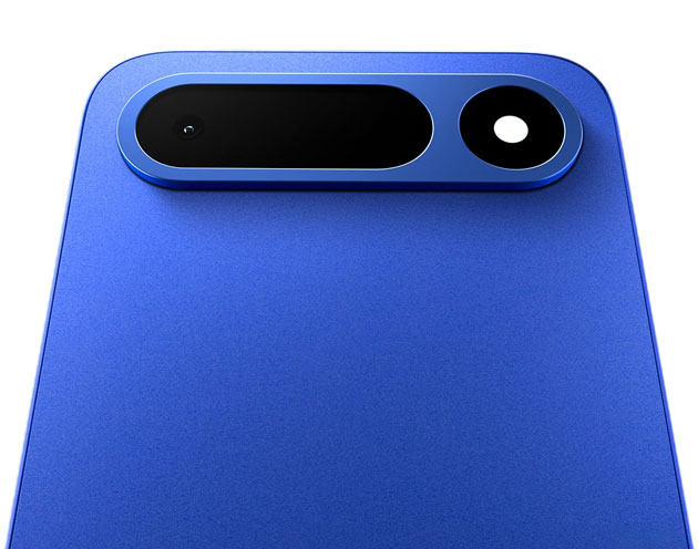
To put it simply, Ripple Green is better for those who want something special and different. But Midnight Blue is a safer option for those looking for a classic phone without any patterns. Just remember that safe means a little bit boring!
If you’ve followed me for a while, you already know which one I’d pick. But now I want to hear from you: which one would you choose?